COVID-19 has been the epicenter of world news, and especially has been the exclusive coverage of Europe over the recent weeks. The world understands Spain and Italy to be two of the hardest hit countries by this virus, and its effects have been seen on international media platforms. It has been covered by every popular media in the EU, especially those in Spain during my time in Barcelona.
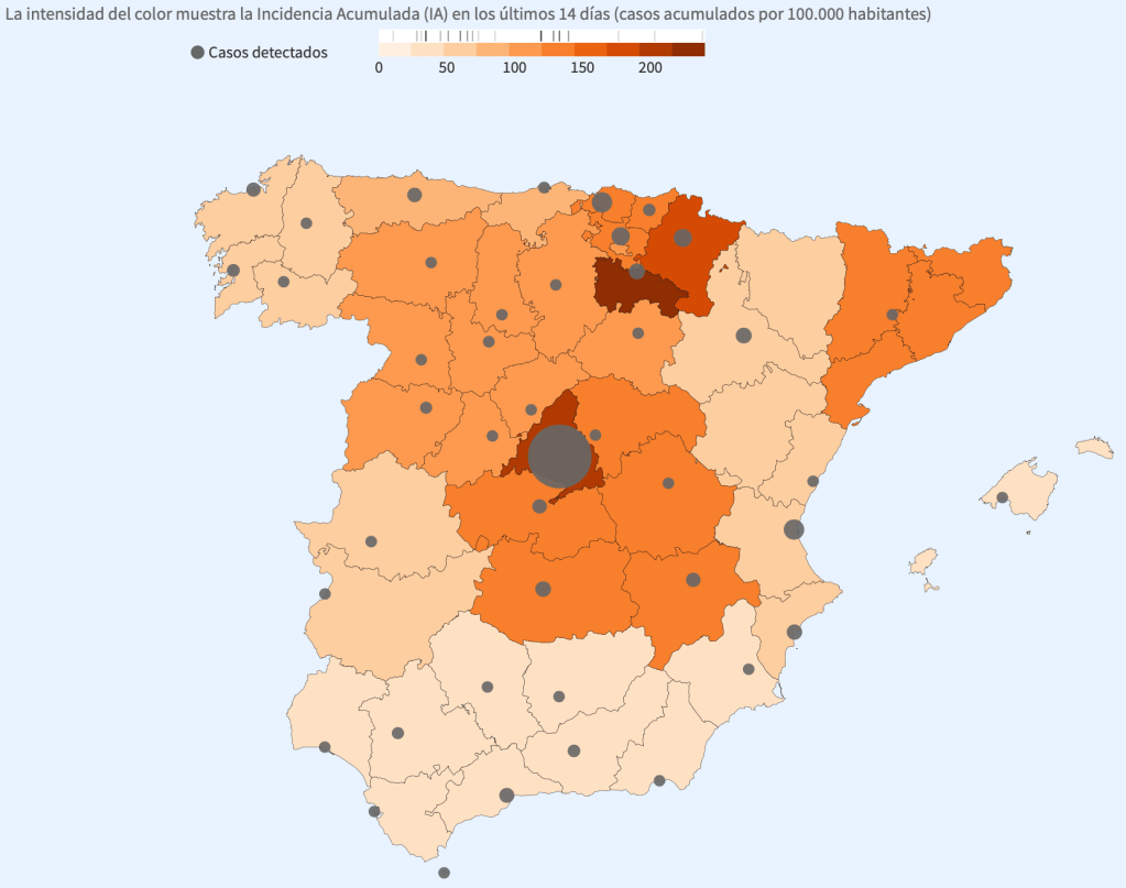
People would often check maps like this one, updated regularly with the number of cases, and where they were. Sources like RTVE provide these maps with logistic information and facts, not as much stories. It is regularly updated and provides the numbers, and any adjustment on the CDC travel advisory. This is a great source to use when looking for the quick information without needing the full story. I personally found this the most effective form of information, since these figures were the parameters being examined pending the decision of the United States whether or not to send their students home.
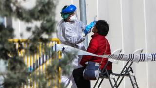
If I was looking for more information about the world as a whole, or the severity of the virus relative to each other, I would often use sources such as BBC. I found that BBC often talked about different areas of the world comparatively, such as their most recent coverage that stated that Spain’s death toll had now surpassed China. This is absolutely shocking to see, as China had been previously viewed as the epicenter of the issue, but BBC and other world news broadcasters have shown the dissemination and major issue of the virus, especially in the US, Italy and Spain. They would not include as much visual content as the other sources I viewed, but did include multiple pictures about mobile testing sites.
BBC also provides more of a global context than other sources in terms of story telling, speaking of notable individuals from the target countries who have contracted the disease, or even some governmental responses to the virus in hopes to flatten the curve. They also included pictures from other areas of Europe, such as Zurich and Germany, whereas other sources stuck strictly to photos of the Spanish crisis.
Sources such as the Washington Post aim to show the effects of the disease, rather than purely factual data. The link above comes from a video in a Washington Post article that shows an olympic ice rink in Madrid having been turned into a temporary morgue due to the massive jump in the death total that Spain has faced in the past few days. Articles like this one often highlight the personal impact of the disease, and the turmoil it has ridden on the country as a whole.

This picture from the Washington Post article shows a makeshift hospital in Montjuic. This is a prime example of the Spanish government rationing their supplies and making an effort to take care of all that they can. This is also, however, a visual example of the crisis that they are facing when deciding who should receive their health care and health resources. They also directly quote in their articles, something that many other sources I examined did not. “There are some hospitals which have already collapsed,” said Oriol Mitjà, an infectious disease specialist at Germans Trias i Pujol Hospital in Barcelona. “They have to make a decision when to admit a patient to intensive care or not, and the criteria is mainly by age, so some elderly people are not prioritized.” This goes to show how hard their health care system has been hit by this virus, and they are now having to make the difficult decisions of who deserves the resources more, and who unfortunately will die from the lack of health care.
Overall, I believe that Spain and the world does a good job with portraying the COVID-19 crisis in a visually engaging way. They accomplish this by posting awe-striking imagery such as temporary hospitals or makeshift morgues, things that cannot be adequately described only in words. This is a field that will continue to be instrumental to the coverage of this virus, and will continue to be the leading cause of why I will do my part in the self isolation.
RTVE.es. “Coronavirus – El Mapa Del Coronavirus En España: 3.445 Muertos y Más De 47.600 Casos.” RTVE.es, March 25, 2020. https://www.rtve.es/noticias/20200325/mapa-del-coronavirus-espana/2004681.shtml.
“Coronavirus: Spain’s Death Toll Surpasses China’s.” BBC News. BBC, March 25, 2020. https://www.bbc.com/news/world-europe-52036836.
Pamela Rolfe, Loveday Morris. “Spain’s Count of Coronavirus Deaths Makes It the World’s Hardest-Hit Country behind Italy.” The Washington Post. WP Company, March 25, 2020. https://www.washingtonpost.com/world/europe/spain-deaths-coronavirus/2020/03/25/93e80342-6e07-11ea-a156-0048b62cdb51_story.html.
